(This work is related to our previous one called HyperStorylines. I recommend it to check it out if you would like to have more context Storyline Visualizations and Hypergraphs.)
Relationships among people in real world contexts commonly include geographical locations (e.g., countries or cities) or other contextual places (e.g., a cafe or a theater). For example, imagine you are a data journalist and want to analyze the election campaign of two political rivals in France, Juliet and Antoine. We can define each political debate between them as a relationship, linking the two candidates, a city and a date. A more complex relationship can consider other events organised by their parties occurring simultaneously in different cities. Here, a single relationship can link the names of the organizers, several locations and a date.
You might be interested in investigating the structure and impact of these campaigns, trying to understand the cities the politicians visited together, if the supporting events happened between contiguous cities or were more wide-spread, and whether the campaign events were organized simultaneously or moved sequentially from city to city following a geographical pattern. Answering these questions requires a visualization of geospatial, temporal, and relationship data.
The goal of this project was to design a visualization that could help users do exactly that: visually explore how relationships among people evolve over space and time. To do so, we divided our work into two parts, each being a contribution:
- Creation of a design space derived from sketching workshops and a literature review of tangentially related visualizations.
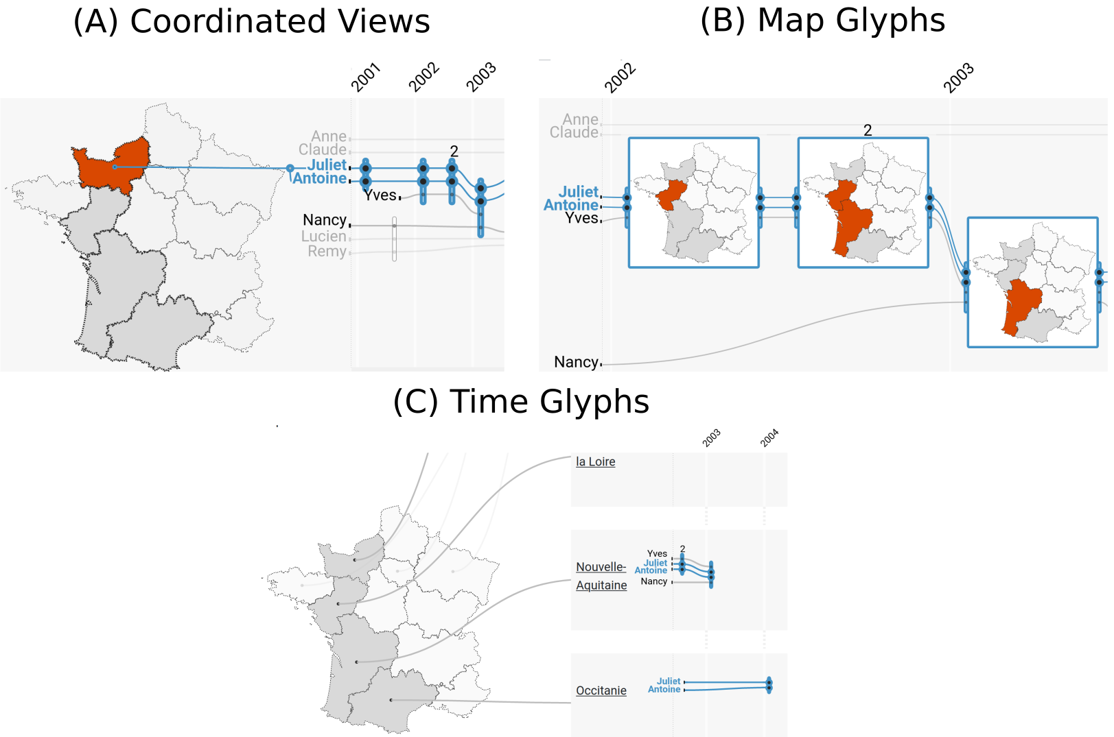
- Evaluation of the three most promising designs from the design space (in the image below). We first evaluated them in a controlled user-study with 18 participants, and then through feedback from domain experts in data journalism.

As you can see, each of them differ in their focus on space vs. time:
- (A) Coordinated Views link the temporal information in the storyline with a separate map on user interactions;
- (B) Map Glyphs split spatial information over multiple maps within the storyline;
- and (C) Time Glyphs split time by representing it in a separate storyline for each geospatial location.
Our study shows that, overall, Coordinated Views were more efficient and preferred than the other two designs. Surprisingly, although Map Glyphs reported no errors in the user study, they were hard to use with a real-world dataset. Finally, even though Time Glyphs did not outperform other techniques in our user study when focusing on a particular location, they were highly appreciated by our expert users. Our work illustrates how Storyline visualizations can be effectively extended to incorporate 2D information, including maps, improving their already considerable expressive power
If you would like to know more details, please refer to the associated publication:
- Golina Hulstein, Vanessa Peña-Araya, Anastasia Bezerianos.
Geo-Storylines: Integrating Maps into Storyline Visualizations. IEEE Transactions on Visualization and Computer Graphics, 2022.


This work was part of Golina Hulstein master thesis at the Université Paris-Saclay.