The objective of this project was to design and develop a visualization to represent relationships among different types of entities that evolve over time. Ok, oouf, very long complicated sentence. Let me try to explain you slowly.
Imagine we are data journalists who are analyzing which politicians appeared together in the news, in which locations they were mentioned, with which organizations and in which dates. Each of these elements can be trated as an entity with a name and a type. For example, if we consider France’s president, the entity that represents him would have the name “Emmanuel Macron” and be of type “person”. We can consider datasets that have many types of entities, such as “people”, “locations”, “organizations” and “time”.
Now, how do we define relationships among these entities? Well, it depends on the context. In our case, we can define that two (or more) entities make a relationship if they were mentioned together in a news article (co-occurrence). Consider this news about the primaries of the ecologist party in France. We can define a relationship as the set of entities that appear in the article (for the sake of the example I just considered the most important ones): {“Sandrine Rousseau”, “Yannick Jadot “, “France”, “Ecologist parties”, “2019-09-24”}. If we consider a bigger set of articles we will have a set of relationships. As articles usually have the dates when they were published, we can try to analyze how these relationships evolve over time.
The dataset I just described can be modeled as a Hypergraph which are the generalization of normal graphs. In this data structures, links are called hyperedges and can contain many number of nodes. We can say that our dataset of relationships can be modeled as a hypergraph in which each entity is a node and each relationship is a hyperedge. When we focus on the evolution of relationships over time we talk about dynamic hypergraphs. Dynamic hypergraphs are hard to visualize given their complexity, so there are not many visualizations that can do it effectively.
We decided to use Storyline visualizations as inspiration to design a new interactive visualization to explore dynamic hypergraphs. Storylines visualizations were inspired by the movie narrative charts by XKCD. The following image (taken from that webpage) shows the movie narrative of Jurassic Park.

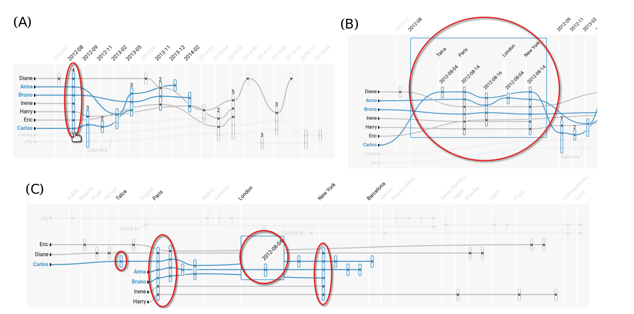
In here, the horizontal axis represents time. Each line represents a character that extends as long as the character is in the movie. Lines come together when the characters interact. Similarly, in Hyperstorylines each line represents an entity that evolves in the horizontal axis. Each hyperedge/relationship is represented by a rectangle that intersects all the people that are part of it. In the following image, we have a small dataset with a relationships circled in red that includes Diane, Anna, Bruno, Irene, Harry, Eric and Carlos:

This image only shows people over time. However, we have other two types of entities (locations and organizations) that are hidden and only visible on demand. To start, we see a third type of entity, that is nested, by clicking on a hyperedge/relationship to expand it as the image below:

Users can select which types of entities they want to see beyond just people and time. For example, the following image shows people as lines, locations in the horizontal axis and time as nested entities:

There are a lot of other cool stuff that users can do with HyperStorylines. If you would like to know more details, please refer to the publication associated:
- Vanessa Peña-Araya, Tong Xue, Emmanuel Pietriga, Laurent Amsaleg, Anastasia Bezerianos.
HyperStorylines: Interactively Untangling Dynamic Hypergraphs. Information Visualization, 2021.


This work was part of the iCoda Project in collaboration with Ouest France.